
Plain Language Is an Accessibility Feature
Plain language isn't writing down to anyone. It's doing the hard part so your audience doesn't have to. Who it helps, the eighth-grade rule, and a quick check for your last post.
A few weeks ago I wrote about readability and what makes your content easier or harder to take in. I promised I’d come back to plain language. This is that article.
I want to start with a confession about my Substack writing.
Every week, when I draft one of these articles, the first version is worse than the one you read. Sure there are typos that get fixed. The bigger issues are:
I explain something as I might in a day-job meeting with colleagues who I’ve worked with for months so we have a shared vocabulary.
I assume you already know what a term or acronym means.
I write a sentence with three commas and a clause folded inside another clause.
It’s hard to catch things like this in a first draft because it all makes sense to me.
Then I go back through and clean it up so it can (hopefully) be understood by everyone.
That second pass is plain language. It isn’t a nicety, and it isn’t a writing-style preference. It’s an accessibility practice, the same as alt text or color contrast, and it deserves to be treated like one.
What plain language actually means
Let me clear up the misunderstanding that makes a lot of creatives bristle at this idea. Plain language does not mean simple ideas. It doesn’t mean writing down to your audience, or sanding the craft and personality out of your work.
Plain language means the idea can be as complex as it needs to be, and the way you deliver it is where the clarity comes in. The complexity lives in the subject. It doesn’t live in the words, sentences, and paragraphs.
Here are the two questions I ask myself when reviewing a draft:
Is the reader able to fully focus on understanding the ideas I’ve written about? That’s good work. The audience is engaged with something they’ve decided is worth their attention.
Or, is the reader having to decode my writing? That’s friction that makes the reader work harder to engage with and understand the material. Everything you do to simplify it is attention the reader gets to spend on what you actually have to say.
That’s the whole goal. Get rid of the friction.
This is true for any kind of writing, fiction or nonfiction, short or long.
Who might miss out
When your content is harder to read than it needs to be, you don’t lose everyone. But you will lose people because not everyone will want to put the time and energy into getting past it.
Here are some key groups to consider:
People with cognitive disabilities. “Cognitive disability” is a broad term covering a wide range of conditions that affect things like memory, attention, and how someone processes language and takes in new information. A dense paragraph takes more work to understand. A clear one takes less.
People reading in a language that isn’t their first. Someone translating as they go can follow a clear sentence comfortably. A sentence with an idiom, jargon, and a buried clause can stop them cold. It’s not because they can’t read, but because you’ve placed obstacles in the writing.
People who are distracted, tired, or simply in a hurry. This group, if we’re honest, is most of us, most of the time. Someone reading your post on a phone, in a line, with conversations going on around them, isn’t bringing their full attention. They’re bringing whatever attention is left over. Plain language helps the person surrounded by distraction. Dense language assumes a calm reader with nothing else going on, and that reader is rarer than we’d like to think.
So, as with many accessibility practices, the clear version of your content is better for everyone in your audience.
The eighth-grade rule, and when to break it
So how clear is clear enough? This is where reading level comes in.
Reading level is a rough estimate of how much schooling someone would need to read a piece of text comfortably, expressed as a school grade. A common guideline for content meant for a general audience is to aim somewhere around an eighth-grade level.
That can sound quite low if you’ve never measured your own writing before. It isn’t. Plenty of capable adults read most comfortably right around there, and even strong readers prefer it. Nobody opens your newsletter hoping to have to concentrate harder.
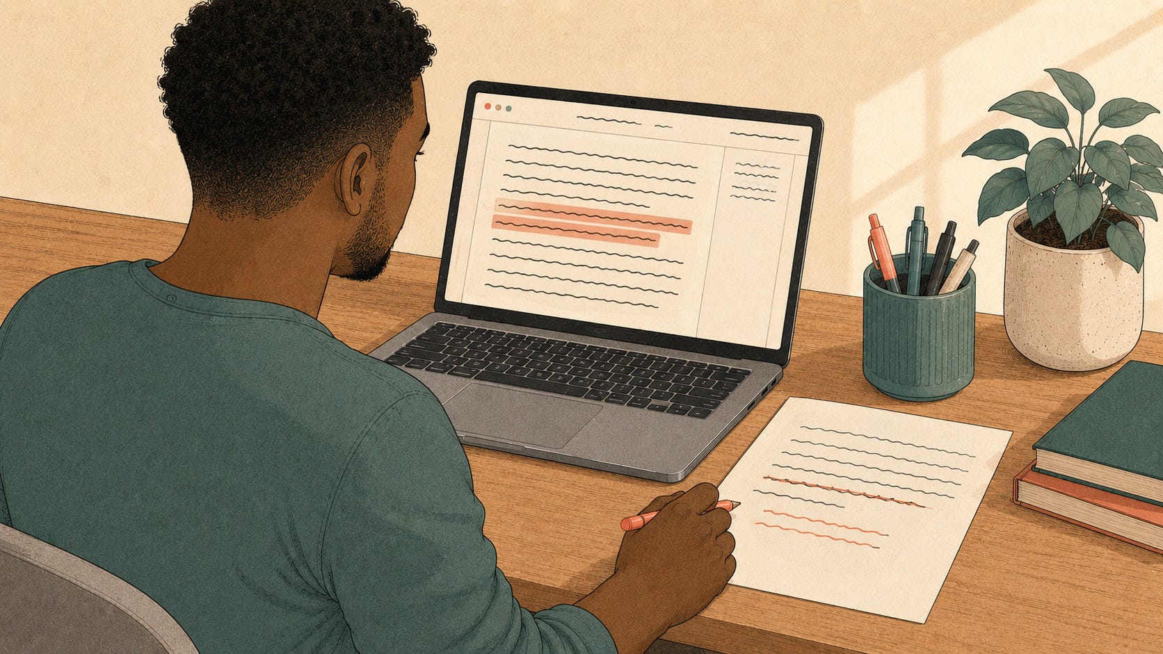
There are free tools that will estimate reading level for you. I’ve used both Hemingway Editor and ProWritingAid. For both, you give it your text, and it gives you a grade level and highlights the specific sentences that are hardest to read. You can see exactly where the trouble is.
Microsoft Word has readability statistics built in too. You switch them on once in the settings, and they appear after you run a spelling and grammar check. If your writing tool has nothing built in, a quick search for “readability checker” turns up free web-based ones.
Now the part that matters just as much: the rule is a guide, not a mandate. Sometimes the precise word is the longer or more technical one, and swapping it for something simpler would actually make you less clear. If you’re writing for an audience that shares a vocabulary, a craft, a profession, a fandom, the right term is the right term, even when it nudges your grade level up.
Remember, a low grade level isn’t the goal. The goal is your audience understanding you. Use the number as a guide that shows you where your writing is dense. From there you can decide, sentence by sentence, whether that density is earning its place.
In case you’re curious, ProWritingAid reported the grade level of this article at six.
The edits that move the number
When I do the second pass on my writing, the same handful of changes do most of the work. None of them ask you to be a professional editor.
Cut long sentences in two. This is the big one. If a sentence carries more than one idea, there’s usually a period hiding in the middle of it. Find it. Two clear sentences almost always beat one impressive one.
Watch your subclauses. A clause tucked inside another clause makes someone hold the first half of your thought in their head while they wait for the rest to arrive. Here’s an example. An earlier draft of that very sentence read: “A clause tucked inside another clause, the thing I do constantly in my first drafts, makes someone hold the first half of your thought in their head while they wait for the rest.” The phrase between the commas is unnecessary. In this example, I deleted it. If it was an important idea, I’d split the sentence. In either case, it’s an easier read.
Swap inflated words for plain ones. “Utilize” is “use.” “In order to” is “to.” “At this point in time” is “now.” The longer versions don’t make you sound smarter. They just cost a beat of effort. Plain words also read as more confident because you aren’t adding filler.
Define your terms and spell out your acronyms the first time they appear. Every time, even the ones you’re certain everyone knows. The cost of over-explaining to the people who already know is tiny next to the cost of losing the people who don’t.
Read it aloud. This is the one I’d keep if I could keep only one. Your ear catches what your eye skims over. If you run out of breath in the middle of a sentence, or you stumble on a phrase, that’s your audience stumbling there too. Fix the spot where you tripped.
No matter what kind of text content you’re creating, these moves apply, whether your audience will read it on a page or hear it read aloud.
Try this today
Open the last thing you published. A newsletter, a blog post, a long social post, a page on your site. Run it through a free reading-level checker and look at the number it gives you. Then look at the sentences the tool flagged as hard to read.
Pick the worst one. Read it out loud. Find the spot where you ran out of breath, and that’s where a period wants to go. Cut that one sentence into two.
Repeat the exercise on any other sentences the checker flagged.
That’s the whole exercise. You’ll feel the difference right away, and you’ll start spotting the same fix everywhere you look, which is exactly what you want.
Next Thursday (July 30): What an Accessibility Scan Will (and Won’t) Tell You, a look at the free tools that check your site for you, what they actually catch, and the things no scanner can detect.
See you next Thursday.
— Jeff
Digital Accessibility – Content for Everyone is a free weekly post from Jeff Adams about making your digital content—your site, your podcast, your newsletter, your social media—usable by everyone who shows up to it. Built on the foundation of Content for Everyone, the book Jeff co-wrote with Michele Lucchini. Companion site: contentforeveryone.info.